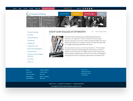
The State University of New York (SUNY) College of Optometry is a university based in New York City that specializes in optometry and vision science. Founded in 1971, they offer a Doctor of Optometry degree, complete with residency program, as well as MS and PhD degrees. Their University Eye Center is one of the largest optometric facilities in the United States. SUNY College of Optometry is a leader in both patient care and clinical research, putting an emphasis on both innovation and inquiry, to advance optometric discovery. They are devoted to advancing visual health through leadership, education, and research.
The Problem
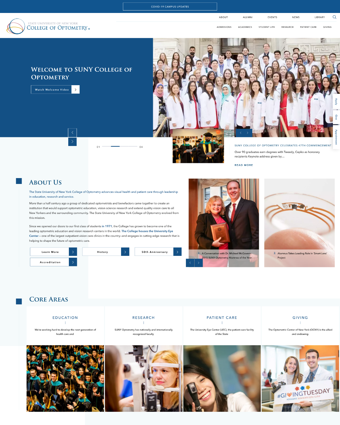
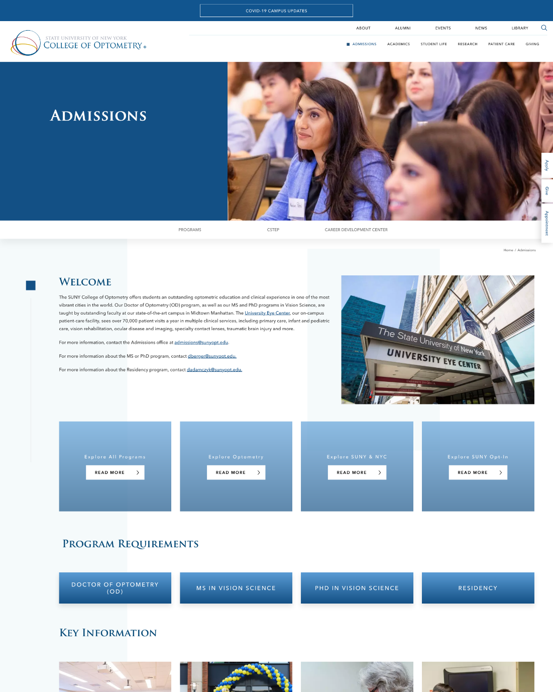
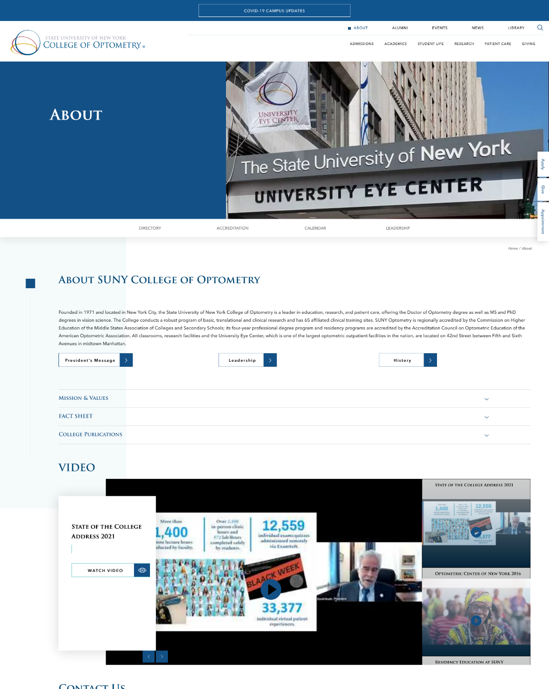
The SUNY College of Optometry website lacked consistency with their messaging. They had no strong calls to action, which led to weak lead generation. They also had poor mobile compatibility, so users on smartphones and tablets had difficulty accessing the site and viewing it correctly. The site’s brand image was also outdated and required a complete reimagining. All of these things had a significant negative impact on the university’s digital presence. The site’s functionality needed a significant overhaul, with a greater emphasis on both user interface and user experience. Most importantly, the website had significant functionality problems. The navigation wasn’t user-friendly, and the site lacked several key features necessary to their business.
Analysis
The SUNY College of Optometry website needed to be thoroughly updated with modern design technologies and administrative best practices. That included creating a more robust and responsive mobile site, as well as improving the site’s brand continuity. Furthermore, the site needed the ability to include a calendar of events in different categories, with both pre and post templates, as well as improved digital access for faculty members, and password-protected pages for site administrators.
The Solution
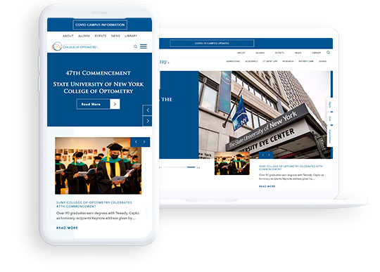
MaxBurst completely reimagined the SUNY College of Optometry website, including new themes and updated content. They used the most up-to-date web design technologies available, to improve site navigation for both users and admins. This included a new website framework built on the Linux-Apache-MySQL-PHP stack. They also addressed mobile responsiveness using the Bootstrap grid, to ensure that the website renders correctly and optimally on any device—including all mobile, tablet, and desktop platforms.
They also made form platforms more consistent, so both prospective students applying to the university, and patients making optometry appointments, could interact with the university more easily and dynamically. And they added the ability for admins to include a calendar on the site, featuring a regularly updated listing for events in different categories, along with pre and post template changes.
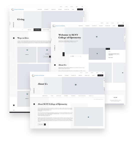
The site’s new design was seamlessly integrated into the latest version of WordPress, to make editing and customization of pages easier. This included SEO optimized plugins for increased web traffic, along with custom theme coding. To preserve SEO rankings for existing pages, they set up 301 permanent page redirects in an HTACCESS folder, so that old links would automatically be taken to new links.
MaxBurst implemented best practices for UI/UX design and development control through the content platform. They also added password-protected pages solely for admin use, so that site administrators could share information more easily behind the scenes, and keep the site running more effectively.
To improve lead generation, they implemented stronger calls to action on the website, in order to grab users’ attention and compel them to interact with the site in a more dynamic way. This allowed more students to submit information and/or make inquiries, which in turn gave the university access to a greater pool of quality leads to pursue. They also integrated all of the university’s existing social media campaigns into the site, so that site users can share content they find interesting to their Facebook, Twitter, or other social accounts, directly from the website—thus improving site interaction and lead generation even more, as well as providing a built-in promotional tool.
Making interaction with the site easier meant they also needed to put in stricter guards against spam, adbots, malware, etc. So they added Captcha tools to all web forms, to screen out bots. They also implemented e-mail verification upon form submission, along with other anti-spamming measures, to ensure only genuine, high quality site interaction got through. They also utilized a variety of other industry standards and best practices for web security and intrusion detection, to keep the site safe from attacks.
The Results
The site’s new, creative, high-end design not only looks better to visitors, but is easier for administrators to maintain. The improved mobile responsiveness and easier site navigation provides higher quality web traffic, which increased lead generation. The new, easily updatable student event calendar has made it simple to keep track of what was going on at the University at any given time. The password-protected pages has made editing the site easier for admins, and the improved digital access for faculty members increased productivity across the board.