
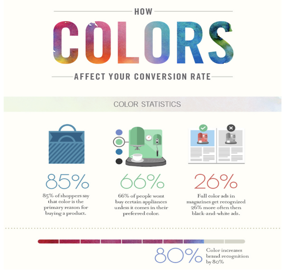
Often associated with trust and professionalism, it’s a frequent choice for industries like finance and technology.
In today’s dynamic digital landscape, where consumer preferences evolve rapidly and attention spans dwindle, businesses seek innovative ways to engage their target audience and drive conversions. In this regard, email marketing has emerged as a dependable strategy, proven to be a potent tool for not only reaching customers but also compelling them to make purchasing decisions. However, the effectiveness of this strategy goes hand in hand with the need for consistent and strategic design optimization, a task best handled by professionals, to ensure alignment with branding and business goals.
Email marketing’s efficacy in driving purchases stems from its direct approach. By curating tailored content and offers, businesses can connect with their audience on a more personal level, resonating with their needs and preferences. Through targeted email campaigns, brands can showcase new products, provide exclusive promotions, and share valuable insights, nurturing customer relationships and fostering a sense of loyalty.
Since the field of digital communication is anything but static, consumer tastes, technology, and trends are in constant flux. This reality underscores the importance of regular design optimization within email marketing campaigns. Professional web designers and digital agencies possess the acumen to craft visually appealing and user-friendly email templates that encapsulate a brand’s identity while adhering to the latest design trends and responsive design principles. This ensures that email campaigns render seamlessly across various devices and screen sizes, avoiding potential pitfalls that might otherwise discourage engagement and conversions.
A well-designed email not only entices recipients to open and read it but also guides them seamlessly toward the desired call-to-action (CTA). Let us explore ten indispensable email design principles that can translate your campaigns to more conversions.
1. Crystal-Clear CTAs with Visibility and Clickability
A call-to-action (CTA) is the heartbeat of any email campaign. It is the gateway to conversions, be it purchasing a product, signing up for a webinar, or downloading an eBook. Ensuring that your CTA is easily visible, and clickable must not be compromised. Use contrasting colors, such as bold shades against a clean background, to make the button pop. Furthermore, label your CTA with action-oriented words that guide users toward a specific outcome, compelling them to click.
2. Employing the F Pattern and Aligning with Customer Reading Habits
Research has shown that users tend to read emails in an F-shaped pattern, scanning horizontally across the top and then vertically down the left-hand side. Design your email layout to follow this pattern, positioning vital information along these natural reading trajectories. This technique maximizes the chances of users catching your message and CTA, even in a quick scan.
3. The Power of Color Psychology
Colors serve as a potent language in brand communication, a crucial component in email marketing. The significance of color choices lies not only in their visual appeal but in their ability to convey a brand’s identity and evoke emotions, ultimately shaping how recipients perceive and engage with an email campaign. Studies show that 85 percent of customers’ purchasing decisions are influenced by color, underlining its significance in your email design.
1Blue
2Orange
With its vibrant and energetic nature, it exudes friendliness and warmth, making it suitable for entertainment and hospitality brands.
3Green
Symbolizing growth and nature, it aligns well with eco-conscious brands, health products, and businesses focused on sustainability.
4Purple
A color of luxury and creativity, it finds its place among high-end brands and artistic ventures.
5Red
Intense and attention-grabbing, it signifies passion and urgency, making it apt for sales and promotions.
6Black
Representing sophistication and power, it appeals to luxury brands and products with a premium feel.
7White
Often overlooked but vital, it signifies simplicity, purity, and openness. It’s a canvas for highlighting other colors and ensuring a clean, modern aesthetic.
Keep in mind this simple guide to help you decide on what color to use, however, ensure that your color choices harmonize with your brand’s values and target audience’s psychology. Consistency in color usage across campaigns strengthens brand recognition, establishes a cohesive visual identity, and triggers the desired emotional responses.
4. Guiding the Gaze
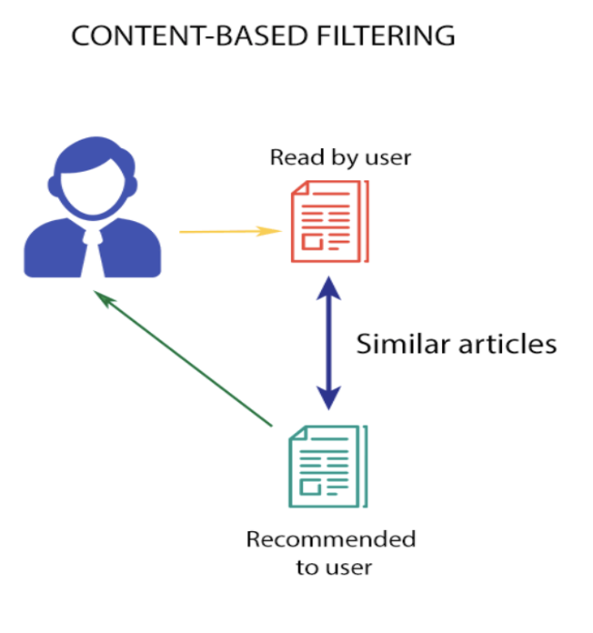
An effective email design guides the recipient’s eye naturally toward the CTA. Placing product images atop the CTA button can boost conversion rates by creating a visual synergy that aligns with the user’s intent. This not only enhances engagement but also simplifies the decision-making process. Through content-based filtering, product recommendations and liquid objects have emerged as potent tools utilized in email marketing today. It allows marketers to craft more personalized content by inserting product images based on past consumer behaviors. An item previously viewed or purchased by your reader becomes your recommended product. By delivering what customers want, you enhance their shopping experience, thereby increasing the conversion rate and creating more opportunities for cross-selling.
5. The Elegance of White Space
White space, or negative space, is the breathing room around elements in your email. It provides visual clarity, enhances readability, and emphasizes important components like your CTA. Surrounding your CTA with adequate white space gives it prominence and ensures it doesn’t get lost amidst cluttered design elements.
6. Crafting Directional Cues
Effective email design employs subtle visual cues that direct the reader’s gaze toward the CTA. Arrows, images of people looking towards the CTA, or even textual cues like “Discover More” can channel the user’s attention. By strategically placing these cues, you guide the recipient’s eye to exactly where you want them to look leading to an increased click-through rate. Integrate directional cues from your email marketing to your larger campaign to usher your user to a familiar journey.
7. Unveiling Visual Hierarchy
Most people will not read every word in your email, but images will grab their attention therefore thoughtful placement of visual elements is crucial. Visual hierarchy is the arrangement of elements in a way that guides readers to consume content in the desired order. Use contrasting fonts, sizes, and colors to create a hierarchy that organizes your content logically. Your brand logo, headline, subheading, product image, and CTA should progressively guide the reader toward the main action you want them to take.
8. The Mobile-Friendly Imperative
In an era where mobile devices dominate internet usage, email designs must be mobile-responsive. Your email should adapt seamlessly to various screen sizes, retaining its visual appeal and functionality. If your content does not render effectively in mobile your campaign will naturally be ignored. Therefore, a mobile-friendly design ensures that your emails are easily accessible and navigable to the majority of your audience.
9. The Email Fold Division
The top portion of your email, visible without scrolling, is referred to as the “email fold.” Crucial information, including your main message and CTA, should appear above this fold to capture immediate attention. In the case of lengthy content, a teaser or gist of the full copy should be included above the fold. This ensures that your reader captures the essence of your campaign even if they only read the top of the fold. Additionally, break up your text into smaller chunks, use bullet points, and employ concise paragraphs to make your content scannable. Users are more likely to skim emails, so make sure your key points are easily digestible.
10. Finding Text-Image Balance
Achieving a harmonious equilibrium between text and images is essential for email design. Too many images might trigger spam filters, while heavy reliance on text can overwhelm readers. Integrate images that complement your message, and use alt text for image descriptions. This not only aids accessibility but also ensures your message is conveyed effectively even if images are blocked.
Finally, after crafting a compelling email design, testing becomes an essential part of the process. Share your email drafts with friends, family, or employees to gauge their reactions and understand how users might interact with your content. Their feedback can provide valuable insights into how recipients perceive and engage with your email. Regular testing and refinement help you stay attuned to evolving customer preferences and optimize for better results.
Furthermore, design optimization isn’t solely about aesthetics; it’s a strategic move that reinforces a brand’s positioning and messaging. A cohesive and consistently presented brand image fosters trust among customers, translating into more substantial long-term gains. Design principles combine art and science, allowing marketers to craft visual content that captivates and compels user action with the potential to transform casual readers into loyal customers.
The implications of these practices are particularly pertinent for startups seeking to carve their niche in the market. In the initial stages, establishing brand recognition, trust, and engagement is pivotal. Startups may lack the resources and experience to navigate the intricate nuances of email design, making guidance from professional’s indispensable. Expert designers possess the proficiency to produce campaigns that align with a startup’s identity and aspirations, enabling them to make a powerful impact right from the outset.
In a rapidly evolving age, where mobile devices reign supreme and consumer behavior adapts swiftly, engaging email design proves to be a worthy investment. Mastering its design principles becomes essential in building a solid foundation for the future growth and success of your brand.
Meet The Author
