
Smart marketers know that an intelligent web design can make a huge difference in conversion rates. Digital first impressions can make or break your credibility as a business. We’ve got some design tips to help you make the best impression on your website’s visitors.
Load Time
Everyone knows that a lengthy load time can increase website bounces and reduce conversions. However, according to MachMetrics, a site speed monitoring service, you start losing visitors after just 3 seconds, the ideal load time.
Consumers’ shortening attention spans are unwilling to wait for long load times when Google is just a click away – potentially leading them to competitors’ speedier websites.
If you want to boost conversions, you need to find ways to make your website load faster.
Compressing images is an easy way to do this. In addition to paying attention to file types, the images on your website could probably suffice to be a bit smaller on-screen, too – in fact, a smaller image is sure to be more mobile-friendly.
Removing unnecessary animations, videos that play automatically, and rotating banners may also make a website run more smoothly.
In 2018, 52.2% of all website traffic was through mobile, so always be sure to check on your website’s mobile functionality after assessing the desktop version of your site.
Hick’s Law
Hick’s Law, or the Hick-Hyman Law, describes the time it takes for an individual to make a decision based upon the number of choices he or she is given. Increasing the number of choices corresponds to longer decision time.
The famous Jam Experiment of 2000 illustrates this point perfectly. One day at a grocery store, shoppers were presented with a display of 24 varieties of jam and a $1 coupon. On a different day, the store displayed a table of only 6 varieties of jam.
Although the table of 24 jams attracted more attention, the store received more purchases when the table only displayed 6 varieties. According to Barry Schwartz, this “decision paralysis” or “analysis paralysis” can affect the smallest things from what to have for breakfast to more important things like picking a career.
How does this relate to web design? Presenting too many options at once to website visitors can be overwhelming, leading to stalled decision-making. This can ultimately lead to consumers abandoning a website and not purchasing anything at all. The customers who do convert may take a long time, which can slow your business’ progress and negatively affect marketing strategy.
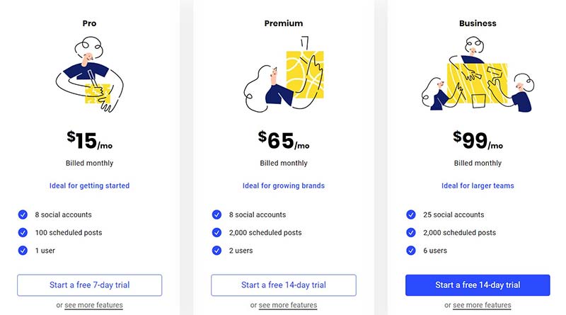
Simplifying options is critical in order to get the most online conversions. Hick’s Law is one of the reasons why businesses like Buffer typically have 3-4 package options, rather than options tailored to every consumer’s exact need.
If you have many items such as sales packages you at least want available for viewing, it might be helpful to link to a different page containing less popular selections, according to UX Designer Paul Boag.
Following Hick’s Law can help your visitors feel at home on your website, and not overwhelmed by choices.
Rule of Thirds
Up to 38% of people admit that they’ll leave a website if they think it’s unattractive. That’s a lot of missed leads! Although the Rule of Thirds won’t solve all of your web design issues, it’s certainly one of the first places to start.
The Rule of Thirds is a photography and videography principle that functions by splitting a frame into thirds. The eye naturally gravitates to the middle rectangle and the points around it, as seen in the image below.
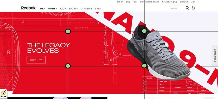
Reebok’s homepage, for example, prominently features a shoe at two of these points. The text by the left two points draws the eye to the CTA (call to action) button.
Using the Rule of Thirds, you can design your website to include important images, text, or CTAs near these points to draw conversions.
Negative Space
Give your elements some room to breathe! Whitespace, or negative space, helps prevent your design from feeling cluttered and cramped together. It also helps important items, like CTAs, stand out.
Negative space doesn’t just refer to the blank spots in your header or sidebar. It also refers to the spaces within text, such as between this paragraph and the one above, and between individual lines and letters. If all this text were lumped together, it would be unreadable!
In today’s age where websites are scanned more often than they are read word-for-word, readability is crucial. If your message doesn’t pop, it won’t be noticed.
Quick Tips to Follow:
- Choose clear fonts rather than decorative ones.
- Avoid the urge to fill negative space with ads or text.
- Make sure your website is mobile-friendly.
- Leave negative space near sidebars; this is especially useful for mobile users who have limited scroll space and may be deterred by cramped designs.
Colors
Pay attention to the colors you choose for your website. While it’s a good idea to maintain consistency with your brand’s colors, you could be losing out on a lot of conversions if you don’t consider how the colors on your website relate to one another, and how colors can be used to influence decision-making.
Text
The text on your pages should be high-contrast. For most websites, this means that you should have black text on a white background or vice-versa.
CTAs (calls to action)
Are there buttons on your website, like “Subscribe” or “Add to Cart” that you want to improve conversion rates on? Make them high-contrast, and be sure to use your contrast color sparingly. A red CTA button, for example, will stand out on a website with a white background that does not already frequently use the color red.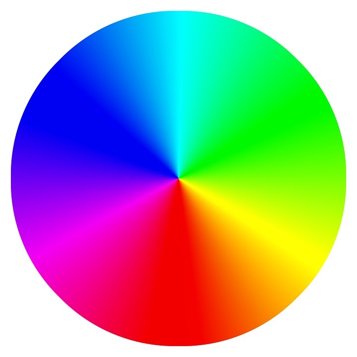
A simple way to figure out the best contrast color for your website is to use the color wheel and locate the color opposite the main colors in your website’s design. If your website’s background is blue, consider making your buttons orange, for example.
If the primary color of your website is white, and your secondary color (your brand’s colors, perhaps) is yellow, consider blue CTA buttons.
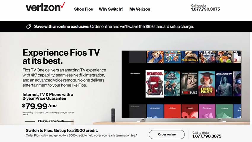
Take the image of Verizon’s website below. Although their call to action buttons are featured prominently, they do not stand out as much as they could because their colors blend with the rest of the website. Changing the button background colors to a simple blue (the color wheel opposite of the red in the Verizon logo) could potentially increase website conversions, for example.
Whichever colors you choose, be sure to keep them consistent across the website. Don’t have a yellow CTA button on one page and a blue CTA on another, for example. Having consistent colors helps to establish brand recognition and makes it easier for consumers to navigate your website.
The one exception to this rule: Social media icons. It may be easier for your website’s visitors to spot your social icons if they are in the platform’s original colors; that is, the colors the brand uses in their own marketing. The blue Twitter bird is instantly recognizable, but if you change the icon to another color to blend in with your website, users might miss the icon altogether.
It may take a while to choose the best colors for your website. Play around with your options until you like what you see.
Eye-catching Imagery or Video
Imagine a website filled with nothing but text, navigation, and calls to action. Pretty boring, huh?
Images and/or videos would help to break that information up. They would also help visitors scan the site and get to the point. What can this company offer me? What do they do?
If you see a picture of a dentist on a website’s homepage, for example, you don’t even need to read the text to have an idea of what that business does.
The trouble is, many DIY website designers don’t know how to obtain high-quality photos or videos to put on their websites.
Fortunately, it’s 2019, and the Internet has a solution for most content needs. If hiring a photographer, videographer, or web designer isn’t an option, you might consider one of these websites to obtain images from, sometimes royalty-free:
It’s also worth noting that you can search for royalty-free images directly on Google. It’s also possible to embed social media posts, so it’s not always necessary to come up with a totally unique image yourself.
Consider the best visual content for your branding, and remember that including people’s faces in media can help consumers build a connection to your brand. Human expressions are priceless and can be very powerful motivators.
Fitts’ Law
Did you know that conversion rates can be affected by the location and size of your buttons in relation to the distance the cursor needs to move?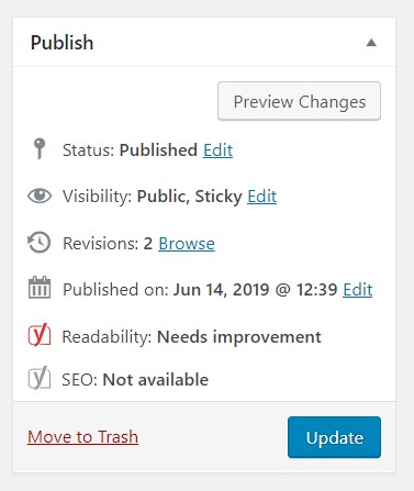
That’s right. It sounds silly, but imagining where your cursor might naturally fall when viewing a website can help improve CTR (click-through rate).
Sound complicated? Don’t overthink it. Navigation bars are a great example of Fitts’ Law applied; since the menu options can take you straight to what you’re looking for, you won’t have to scroll into oblivion. Rather than search for the Celtics’ score all over the news’ homepage, you might head to the sports page first to save time. Understanding what shortcuts your visitors may find useful, and how to apply them, will improve on user experience.
Another example: WordPress’ UI. If you’ve ever noticed that most post publishing options are on the upper right-hand side of the page, it’s not an accident.
Notice how the “Update” button contains a larger font and a unique background color, and is in an easy-to-find location:
The “Edit” links are all less visual since the typical user doesn’t hit them as often as they would the “Update” button. However, they’re all in the same place, just in case.
Adhering to Fitts’ Law doesn’t have to be complicated. Just focus your website’s design on making it as easy as possible for consumers to locate what they’re looking for.
Familiar Design
Unique may be personally satisfying, but it isn’t always better.
Take an e-commerce website designing a new “Add to Cart” button. They’re working on three options, each with an orange background but different text:
- +
- Add to Cart
- + Cart
Which text do you think would be more effective? If you said the second option, “Add to Cart,” you’d be right.
This is because websites like Amazon have so ingrained in us that when you decide to purchase something, you hit the “Add to Cart” button. Hitting anything else would feel unnatural. You might even skim over the button completely.
A new trend in navigation bars has also emerged, whereby users have to wait for animations and then must click several times to get to the information they need. Complicated designs like this can be confusing, and even aggravating for some people.
It’s not necessary to reinvent the wheel to create a beautiful, efficient website.
Landing Pages
Create distinct landing pages for organic search and paid ads. Why? Because the way consumers reach each landing page are fundamentally different. In this example, let’s pretend you are running a local bakery in Dallas, TX.
Organic Traffic Derived from Organic Search or SEO
If you have built up your website SEO, a visitor might search for “bakeries that cater in Dallas, TX” and discover your website. Great! When he clicks on the link to your landing page, he might find a comprehensive description of your establishment, what you offer, testimonials, and what days and times the business is open. You’ve probably paid attention to keywords and have dedicated time to perfect other SEO elements.
However, if your potential customer has discovered your website through paid ads…
Traffic Derived from Paid Ads
If you’ve purchased ads from a service like Facebook or Google, those platforms are intelligent enough to find your potential customers for you without you having to worry about SEO. However, since it’s possible that the user clicked the ad while in the middle of doing something other than searching for bakeries that cater in Dallas, it’s important to get them through the conversion process as quickly as possible. This landing page should be clean and to the point.
Breadcrumbs
You can’t eat these breadcrumbs; instead, visitors use them to easily navigate through your website. They can look like this:
Design Company ABC >> Blog >> Conversions >> Email Marketing Tips for Increasing Conversions
Breadcrumbs are useful on large websites and for websites with a lot of organic traffic. A visitor might search for email marketing tips and find your article, but say the visitor wants to see other articles like it already on your website. They won’t know where to find those articles in the menu unless you point them in the right direction.
Providing your website visitors with more information can only boost your brand’s credibility.
Gestalt Similarity Principle
The Gestalt Similarity Principle as it relates to website design can be summed up like this: The human brain groups similar objects together. In the digital world, it’s important to be able to make connections quickly and accurately.
You can leverage this design law by placing items you want to be associated with one another next to each other. For example, you might have an incredible testimonial. If one of your goals is to increase subscriptions to your mailing list, you might consider placing a CTA button near the testimonial.
The Gestalt Similarity Principle is all about leveraging existing content and organizing it in a way that can lead to better conversion rates.
Final Thoughts
These are just some ideas on how to design a beautiful website that drives conversions. Since SEO and design trends constantly evolve, it’s important to keep up to speed on changes.
It’s also important to conduct A/B testing when working with any of these design tips, since no principle is completely infallible. What doesn’t work on most websites may, in fact, work on yours.
You may not understand how to conduct A/B testing or apply these tips. That’s okay! An agency like Maxburst can point you in the right direction.